One of the topics I enjoy discussing at Indie Web Camps is how we can use design to display activity over time on personal websites. That’s how I ended up with sparklines on my site—it was the a direct result of a discussion at Indie Web Camp Nuremberg a year ago:
During the discussion at Indie Web Camp, we started looking at how silos design their profile pages to see what we could learn from them. Looking at my Twitter profile, my Instagram profile, my Untappd profile, or just about any other profile, it’s a mixture of bio and stream, with the addition of stats showing activity on the site—signs of life.
Perhaps the most interesting visual example of my activity over time is on my Github profile. Halfway down the page there’s a calendar heatmap that uses colour to indicate the amount of activity. What I find interesting is that it’s using two axes of time over a year: days of the month across the X axis and days of the week down the Y axis.
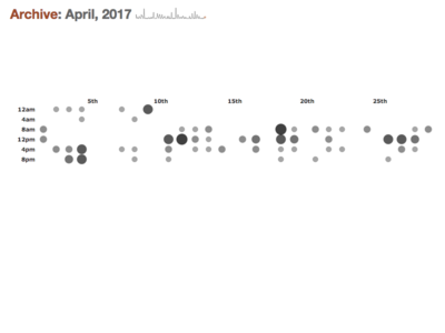
I wanted to try something similar, but showing activity by time of day down the Y axis. A month of activity feels like the right range to display, so I set about adding a calendar heatmap to monthly archives. I already had the data I needed—timestamps of posts. That’s what I was already using to display sparklines. I wrote some code to loop over those timestamps and organise them by day and by hour. Then I spit out a table with days for the columns and clumps of hours for the rows.
I’m using colour (well, different shades of grey) to indicate the relative amounts of activity, but I decided to use size as well. So it’s also a bubble chart.
It doesn’t work very elegantly on small screens: the table is clipped horizontally and can be swiped left and right. Ideally the visualisation itself would change to accommodate smaller screens.
Still, I kind of like the end result. Here’s last month’s activity on my site. Here’s the same time period ten years ago. I’ve also added month heatmaps to the monthly archives for my journal, links, and notes. They’re kind of like an expanded view of the sparklines that are shown with each month.
From one year ago, here’s the daily distribution of
And then here’s the the daily distribution of everything in that month all together.
I realise that the data being displayed is probably only of interest to me, but then, that’s one of the perks of having your own website—you can do whatever you feel like.

Комментариев нет:
Отправить комментарий